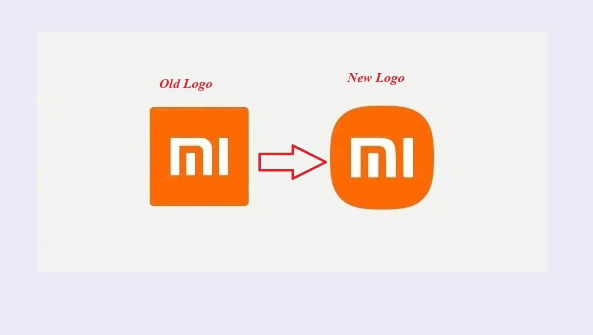
Xiaomi Unveils New Logo and Brand Identity
The big change in the new logo is its rounded edges. There’s also the new MI typography which adds a more pleasing look to the company’s name next to the logo. Xiaomi specifies that it wanted a more graceful look to its brand identity and one which symbolizes its energetic nature heading into the next decade.
The corporate colour remains orange to continue to convey the liveliness and youthfulness of Xiaomi. Black and silver will also be used as supplemental colours to accommodate high-end product line applications. Check Also: Xiaomi Mi 11 Ultra is Now Live with Two Screens and Powerful Camera Sensors The concept of Alive is Xiaomi’s thinking and response to the turning point in the era of intelligent interconnectivity. Xiaomi CEO, Lei Jun, said
