Minor Adjustment in YouTube Music
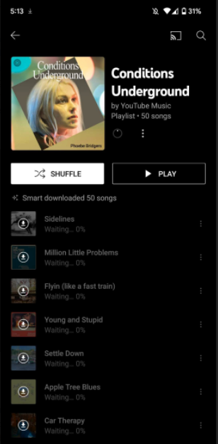
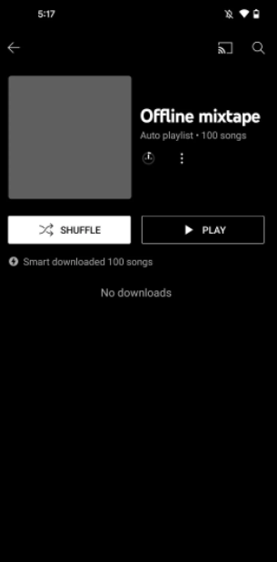
In the current version of YouTube Music’s smart downloading menu, you will notice a new glitter icon where the previous lightning icon used to reside (via 9to5Google). Smart downloads were introduced in 2019, making it simple for users always to have plenty of tunes when they’re offline or in the air. Undoubtedly, they are one of the most appreciated upgrades from the user’s point of view.
The application has featured a lightning bolt icon right next to any playlist and mixes with smart downloads activated from its early days in YouTube Music. It is no longer the situation as of this week. Also read: Meta introduces special designed Earth Day stickers and features across their platforms to create awareness on climate change
This is a Revised Change to 3-Years Old Feature
This new sparkling icon makes no changes to how the feature operates. But it’s an intriguing addition to a three-year-old function. Directly downloaded content, on the other hand, still displays the familiar down-arrow indicator. The change was first seen on YouTube Music v5.02.50, which began rolling out to subscribers last week. What do you think of this minor adjustment in the already present feature? Although it is a minor improvement in the already present feature, it looks pretty attractive in our opinion. Also interested in: Witness the amazing action at the Free Fire World Series 2022 Sentosa featuring a US$2,000,000 prize pool!

